
<case-study> · july 2026
I ran my CRO teardownon my own store,then fixed it.
Before I sell a conversion audit to anyone, I run it on my own store first.
I run a Shopify store — Upwegrow Tropicals — so I ran the teardown on it. It found two problems that were quietly killing sales: sold-out plants showing as "In Stock" and then failing at checkout, and a catalogue you couldn't actually browse. I fixed them, rebuilt the store, and re-walked it end to end. This is the same teardown I'd run on your store.
13
issues flagged
7
fully fixed
2
revenue-blockers closed
1
still open
The setup
I don't have a wall of client logos yet. What I have is a real store I run myself, and a habit of proving a method on my own business before I charge anyone for it.
Upwegrow Tropicals is my e-commerce store — greenhouse-grown houseplants and bioactive supplies, shipped across Canada. It's a good brand with genuinely strong photography and product copy. And it was still leaking sales. That gap — a store that looks finished but isn't converting — is exactly what a CRO audit is for, so I pointed my own process at it.
The point of this page isn't "look how good the new store is." It's: here's the exact teardown I'd run on your store, here's what it caught on mine, and here's the proof I acted on it.
What I did
I walked the store the way a real shopper moves through it — homepage, navigation, collection pages, product page, cart, and an actual checkout — on desktop and mobile. Not a 40-point generic checklist. A funnel walk that reasons from what's actually on the page, ranks every finding by the money it's costing, and ends with the handful of things worth fixing first.
Then I did the part most audits skip: I implemented the fixes, rebuilt the store, and ran the whole teardown a second time to confirm each fix actually held.
What it found — the two that mattered
Most of the thirteen findings were housekeeping. Two were revenue-blockers, and they're the ones worth showing.
1. The inventory was lying. A plant's page said "Availability: In Stock." You could add it to cart. Then checkout stripped it back out as SOLD OUT. I hit this live, on the first plant I picked. That's a lost order and broken trust at the single most expensive moment in the funnel — the pay step. The root cause wasn't the design, it was inventory tracking left off on individual products, so the theme defaulted every one of them to "In Stock" whether it was true or not.
2. You couldn't browse to the plants that were for sale. "Shop" dropped you into a wall of roughly forty collections, most of them reading "0 products." The real plants were buried under dozens of dead ends, behind a hidden hamburger menu, with no way to filter. A store full of plants that reads as empty.
Neither of those is a matter of taste. They're "the customer literally can't buy," and that's where the money was going.
What changed — the before and after
Six places in the funnel changed. Each frame below is the same screen before and after.
-
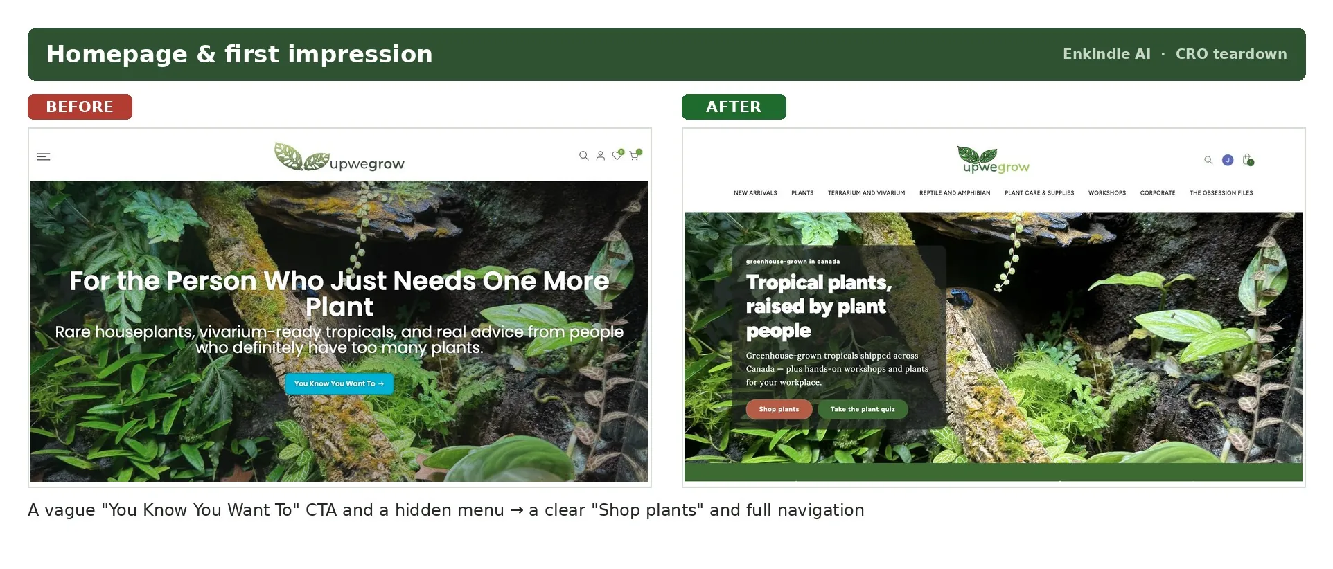
Homepage & first impression A vague "You Know You Want To" button and a menu hidden behind a hamburger became a clear "Shop plants" call to action with the full navigation on show. -
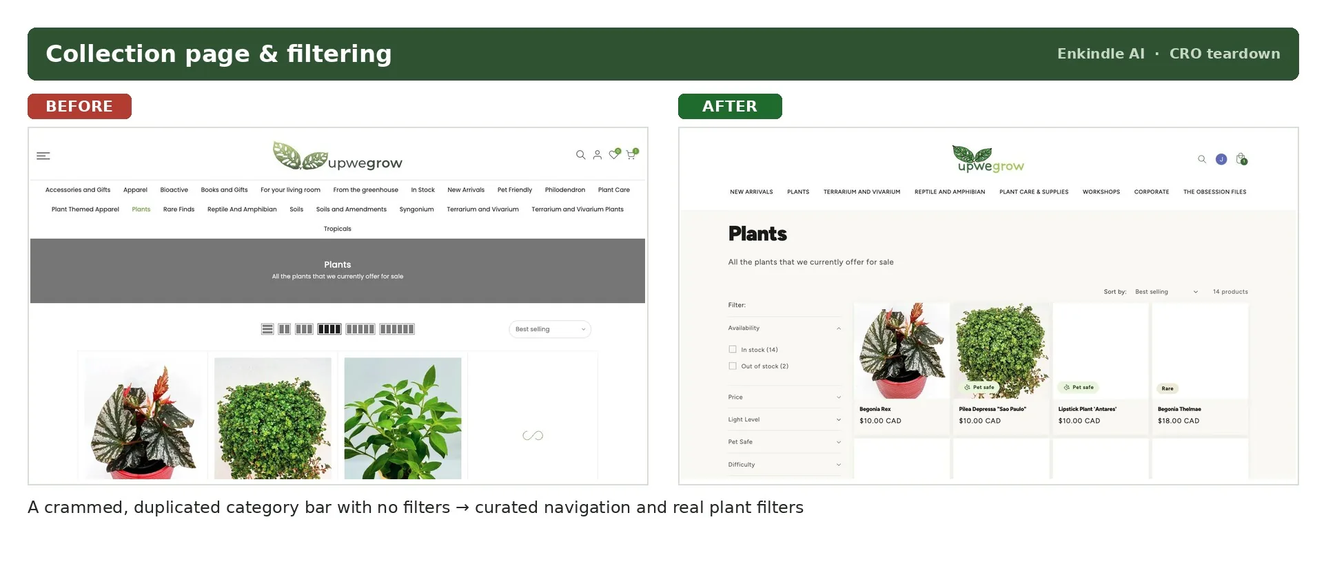
Collection page & filtering A crammed category bar full of duplicates and empty genus links, with no filters, became curated navigation plus real plant filters — light level, pet-safe, difficulty, rarity. The things a plant buyer actually shops by. -
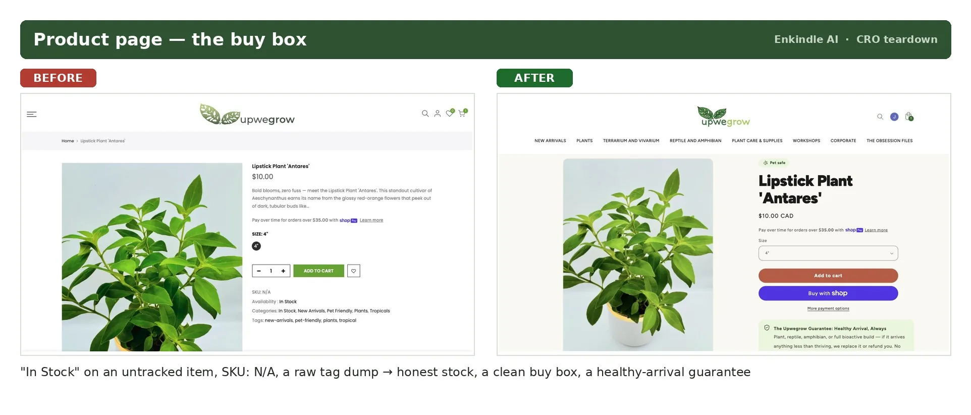
Product page — the buy box "In Stock" on an untracked item, a "SKU: N/A", and a raw dump of categories and tags became honest stock ("Only 2 left"), a clean buy box, and a healthy-arrival guarantee right under the Add to Cart button. -
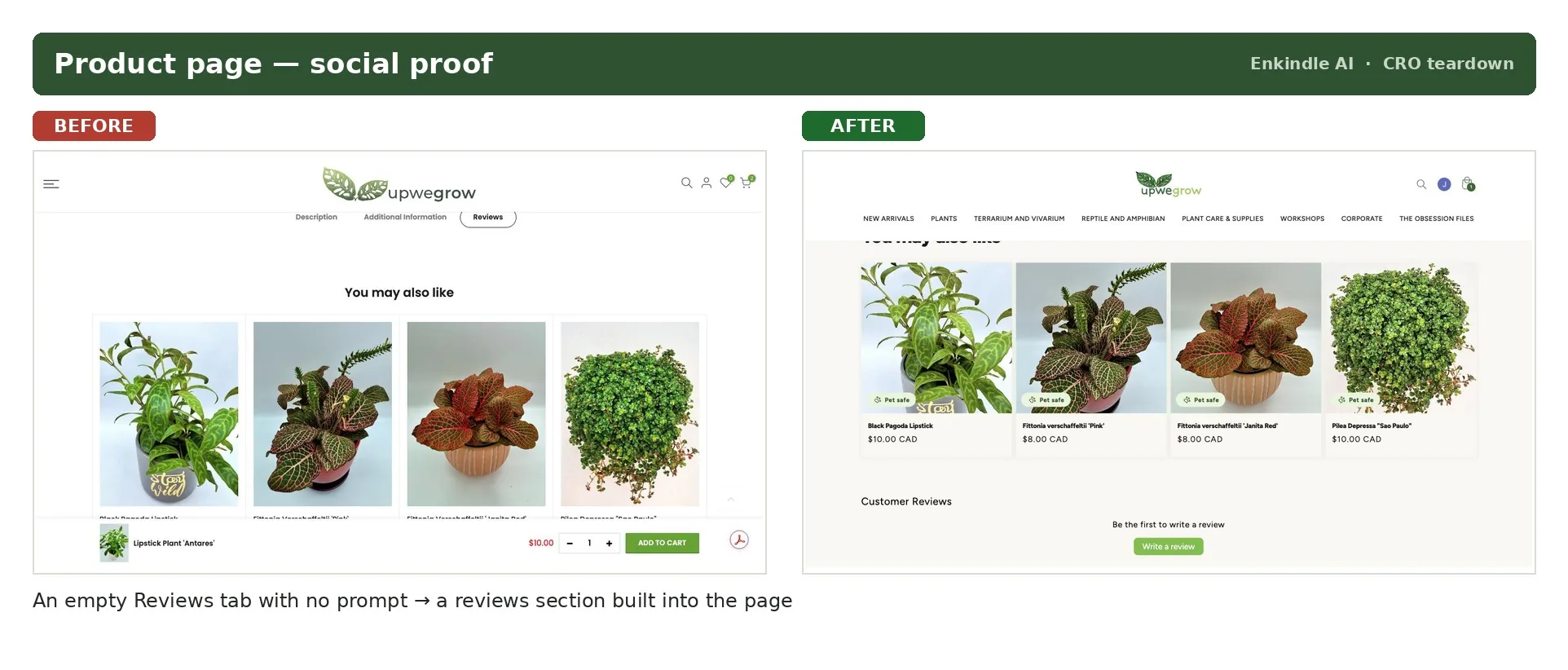
Product page — social proof An empty Reviews tab, tucked away where nobody would find it, became a reviews section built into the page. -
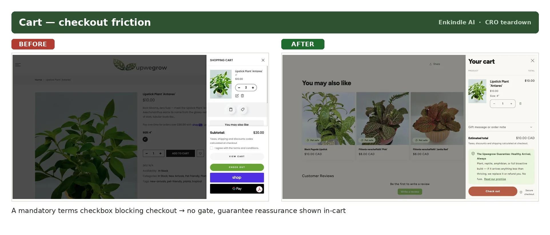
Cart — checkout friction A mandatory "I agree to the terms and conditions" checkbox that silently blocked the checkout button became a clean cart with no gate and the arrival guarantee shown right there. -
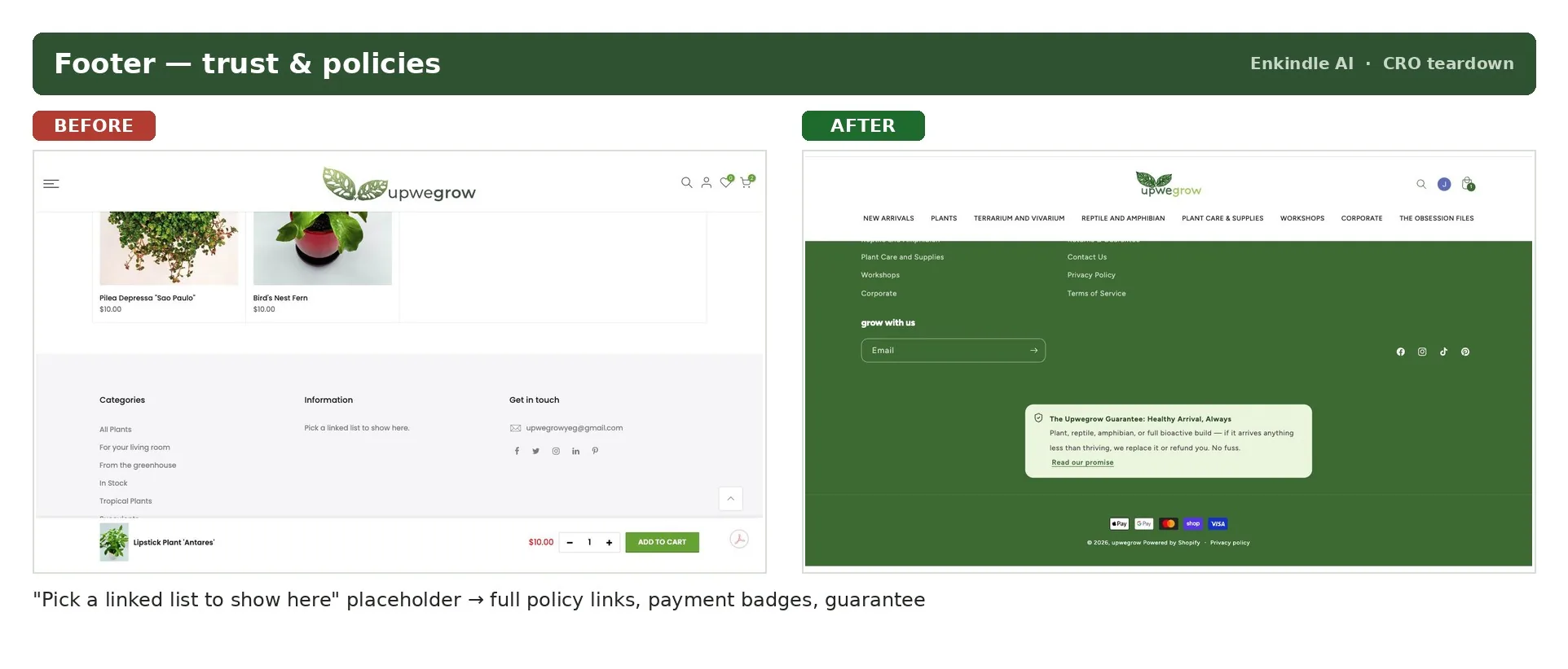
Footer — trust & policies A literal "Pick a linked list to show here" placeholder — no shipping, returns, or policy links anywhere — became a proper footer with real policies, payment badges, and the guarantee.
The headline fix, verified live: the exact plant that used to fail at checkout now shows honest stock, adds to cart cleanly, and reaches a working checkout with the item intact.
The honest scorecard
Of the thirteen issues the first teardown flagged:
- Fully fixed: 7 — including both critical revenue-blockers.
- Partly fixed: 5 — the reviews app is installed but not yet seeded with real customer photos; the empty collections are gone from the customer's path but still need deleting at the data level for SEO.
- Still open: 1 — a free-shipping threshold and bundles to lift average order value.
I'm not going to tell you this added "30% to conversion." I don't have the analytics to claim a number like that, and I won't invent one. What I can show you is that the leaks that were costing sales are closed, and I re-walked the store to confirm it. When a store gives me analytics access, that's when I can point at exactly where the drop-off was and put a real number on it.
What this means for you
If you run a Shopify store, the odds are good it has at least one of these leaks — a checkout that fails quietly, a catalogue that's hard to browse, trust signals that never got finished. You usually can't see them, because you built the store and you already know where everything is. A first-time buyer doesn't.
I'll walk your store the same way I walked mine, and tell you the handful of things costing you sales — ranked by money, not effort. I review your store as an operator and a developer, not a theorist.
Send me your store URL and I'll point out the first few things I'd fix, no pitch. If it's useful, the full audit goes deeper.